There is also an option to save a graph design offline so they can be exported easily. There are many other features which make the usage of the library very easy:
- Save graphs for offline usage as vector graphics which are highly optimised for print and publication purposes
- The charts exported is in the JSON format and not the image format. This JSON can be loaded into other visualisation tools like Tableau easily or manipulated with Python or R
- As the graphs exported are JSON in nature, it is practically very easy to embed these charts into a web application
- Plotly is a good alternative for Matplotlib for visualisation
To start using the Plotly package, we need to register for an account on the website mentioned previously to obtain a valid username and API key with which we can start using its functionalities. Fortunately, a free-pricing plan is available for Plotly with which we get enough features to make production-grade charts.
Installing Plotly
Just a note before starting, you can use a virtual environment for this lesson which we can be made with the following command:
source numpy/bin/activate
Once the virtual environment is active, you can install Plotly library within the virtual env so that examples we create next can be executed:
We will make use of Anaconda and Jupyter in this lesson. If you want to install it on your machine, look at the lesson which describes “How to Install Anaconda Python on Ubuntu 18.04 LTS” and share your feedback if you face any issues. To install Plotly with Anaconda, use the following command in the terminal from Anaconda:
We see something like this when we execute the above command:

Once all of the packages needed are installed and done, we can get started with using the Plotly library with the following import statement:
Once you have made an account on Plotly, you will need two things – username of the account and an API key. There can be only one API key belonging to each account. So keep it somewhere safe as if you lose it, you’ll have to regenerate the key and all old applications using the old key will stop working.
In all of the Python programs you write, mention the credentials as follows to start working with Plotly:
Let’s get started with this library now.
Getting Started with Plotly
We will make use of following imports in our program:
import numpy as np
import scipy as sp
import plotly.plotly as py
We make use of:
- Pandas for reading CSV files effectively
- NumPy for simple tabular operations
- Scipy for scientific calculations
- Plotly for visualisation
For some of the examples, we will make use of Plotly’s own datasets available on Github. Finally, please note that you can enable offline mode for Plotly as well when you need to run Plotly scripts without a network connection:
import numpy as np
import scipy as sp
import plotly
plotly.offline.init_notebook_mode(connected=True)
import plotly.offline as py
You can run the following statement to test the Plotly installation:
We see something like this when we execute the above command:
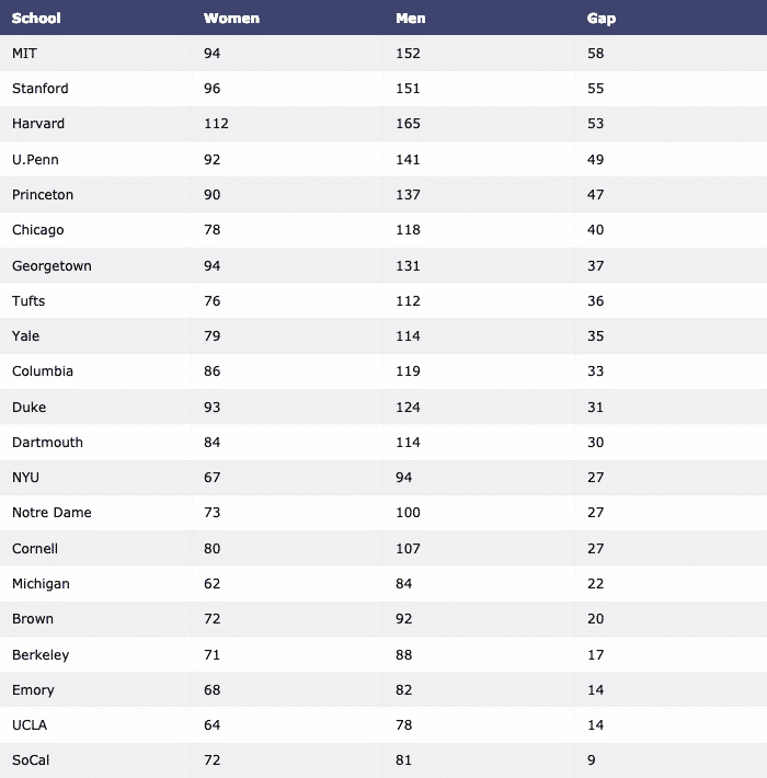
We will finally download the dataset with Pandas and visualise it as a table:
df = pd.read_csv("https://raw.githubusercontent.com/plotly/datasets/master/school_
earnings.csv")
table = ff.create_table(df)
py.iplot(table, filename=‘table’)
We see something like this when we execute the above command:
Now, let us construct a Bar Graph to visualise the data:
data = [go.Bar(x=df.School, y=df.Women)]
py.iplot(data, filename=‘women-bar’)
We see something like this when we execute the above code snippet:
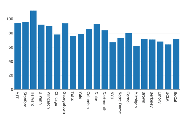
When you see above chart with Jupyter notebook, you will be presented with various options of Zoom in/out over a particular section of the chart, Box & Lasso select and much more.
Grouped Bar Charts
Multiple bar charts can be grouped together for comparison purposes very easily with Plotly. Let’s make use of same dataset for this and show variation of men and women presence in universities:
men = go.Bar(x=df.School, y=df.Men)
data = [men, women]
layout = go.Layout(barmode = "group")
fig = go.Figure(data = data, layout = layout)
py.iplot(fig)
We see something like this when we execute the above code snippet:

Although this looks good, the labels on top right corner are not, correct! Let’s correct them:
men = go.Bar(x=df.School, y=df.Men, name = "Men")
The graph looks much more descriptive now:

Let’s try changing the barmode:
fig = go.Figure(data = data, layout = layout)
py.iplot(fig)
We see something like this when we execute the above code snippet:

Pie Charts with Plotly
Now, we will try to construct a Pie Chart with Plotly which establishes a basic difference between the percentage of women across all the universities. The name of the universities will be the labels and the actual numbers will be used to calculate the percentage of the whole. Here is the code snippet for the same:
py.iplot([trace], filename=‘pie’)
We see something like this when we execute the above code snippet:
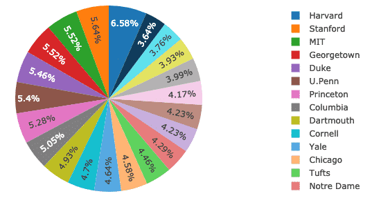
The good thing is that Plotly comes with many features of zooming in and out and many other tools to interact with the constructed chart.
Time Series data visualisation with Plotly
Visualising time-series data is one of the most important task that comes across when you’re a data analyst or a data engineer.
In this example, we will make use of a separate dataset in the same GitHub repository as the earlier data didn’t involved any time-stamped data specifically. Like here, we will plot variation of Apple’s market stock over time:
finance-charts-apple.csv")
data = [go.Scatter(x=financial.Date, y=financial[‘AAPL.Close’])]
py.iplot(data)
We see something like this when we execute the above code snippet:
Once you hover your mouse over the graph variation line, you can specific point details:
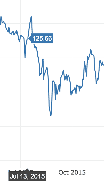
We can use zoom in and out buttons to see data specific to each week as well.
OHLC Chart
An OHLC (Open High Low close) chart is used to show variation of an entity across a time span. This is easy to construct with PyPlot:
open_data = [33.0, 35.3, 33.5, 33.0, 34.1]
high_data = [33.1, 36.3, 33.6, 33.2, 34.8]
low_data = [32.7, 32.7, 32.8, 32.6, 32.8]
close_data = [33.0, 32.9, 33.3, 33.1, 33.1]
dates = [datetime(year=2013, month=10, day=10),
datetime(year=2013, month=11, day=10),
datetime(year=2013, month=12, day=10),
datetime(year=2014, month=1, day=10),
datetime(year=2014, month=2, day=10)]
trace = go.Ohlc(x=dates,
open=open_data,
high=high_data,
low=low_data,
close=close_data)
data = [trace]
py.iplot(data)
Here, we have provided some sample data points which can be inferred as follows:
- The open data describes the stock rate when market opened
- The high data describes the highest stock rate achieved throughout a given period of time
- The low data describes the lowest stock rate achieved throughout a given period of time
- The close data describes the closing stock rate when a given time interval was over
Now, let’s run the code snippet we provided above. We see something like this when we execute the above code snippet:
This is excellent comparison of how to establish time comparisons of an entity with its own and comparing it to its high and low achievements.
Conclusion
In this lesson, we looked at another visualisation library, Plotly which is an excellent alternative to Matplotlib in production grade applications which are exposed as web applications, Plotly is a very dynamic and feature-rich library to use for production purposes, so this is definitely a skill we need to have under our belt.
Find all of the source code used in this lesson on Github. Please share your feedback on the lesson on Twitter with @sbmaggarwal and @LinuxHint.